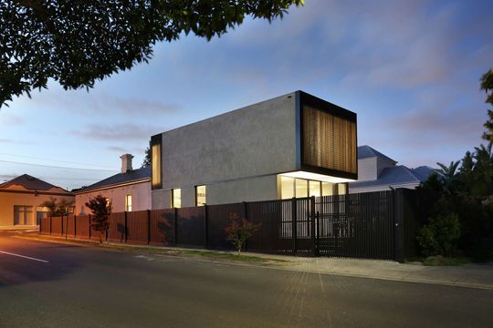
As is typical of Melbourne's inner suburbs, the street front of this house is a quaint Edwardian terrace. It's only thanks to the corner site that we get a sense of what Carr Design Group have created out back. After turning the corner, you quickly move from heritage ornamentation to contemporary simplicity...
Home to a young couple and their two children, the clients purchased the property in 2010. While they had 'extraordinary' renovation plans from the beginning, they chose to live in the house for two years before bringing in the jackhammers. This was a wise choice and gave them the chance to understand how the house worked and the type of spaces they wanted from the alteration and addition. Ultimately they decided they wanted a home that used raw materials, a sense of openness, and plenty of natural light.
Carr Design Group's approach to the project was to create a robust, 'family-proof' design that sits in contrast to the original home. The corner site means both the original Edwardian and the new concrete 'cubes' have their own frontages. The minimalism of the extension contrasts with a neighbourhood of period homes - asserting its modernity, but also reflecting the simplicity of Edwardian materials.
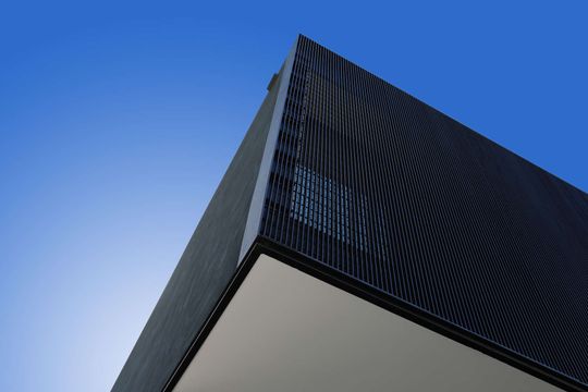
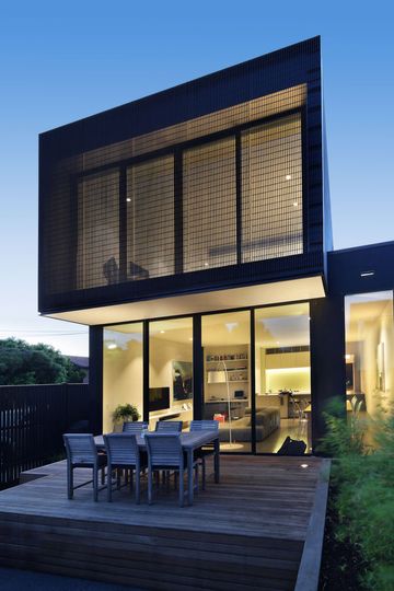
The modern extension is composed of two 'stacked' concrete prisms. The top box is slightly cantilevered over the bottom to provide shade and privacy - a modern take on the traditional eave.
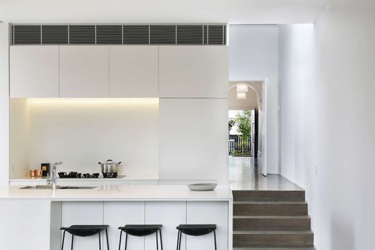
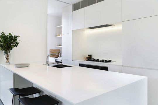
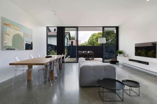
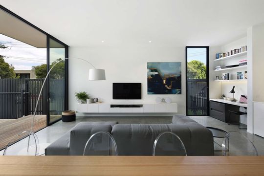
Open plan living takes up the ground floor space. A monolithic white kitchen references the exterior. The entire rear facade is made of floor-to-ceiling glass, leaving the living space to frame and then dissolve into the outdoors.
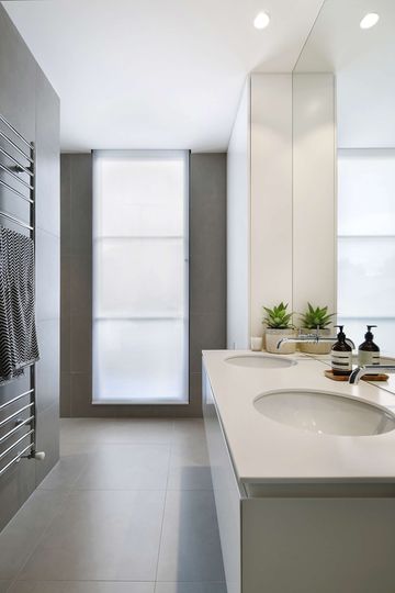
The material palette is pared back and honest. Timber floors in the front of the house provide texture and warmth. Steel framed black windows and white walls play off the concrete floors. There is a minimal, almost industrial aesthetic. Externally, there is an uncomplicated rawness. Enveloped in a natural grey render, the striking form will age and develop beautifully over time.
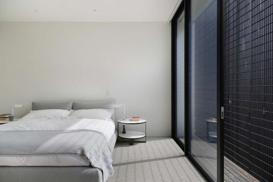
Upstairs the master bedroom contrasts with the openness of the ground floor living area. Play of light through a metal screen casts a variety of shadows during the course of the day. The bedroom is "big yet intimate, enclosed but open, luxurious and minimal."
"One of the major concerns right from the beginning was this issue of privacy,” explains McCue. “To overcome this issue, while creating a novel residential solution, we wrapped the second glazing level in a fine layer of mesh. This interlay not only provides an impermeable cloak of privacy, but it also allows for sunlight and views." - Chris McCue, Director of Carr Architecture
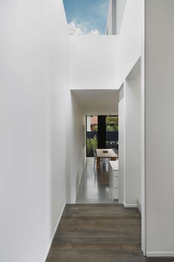
The new part of the building is playfully pulled away from the original terrace. In the void created, natural light spills in through skylights. This light-filled vertical space, without a defined purpose, has become a place with views of the surrounding garden, an area for repose and reflection, study and work, peace and quietness.
The light void also plays an important trick on the eye and might. From either end of the house, the space hints at openness and the outdoors, making the whole house feel more spacious and more generous.
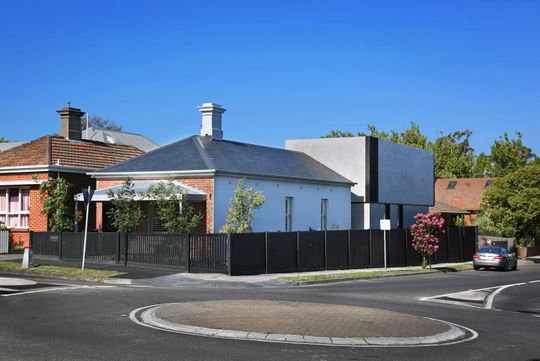
For a sometimes conservative Kew, Cube House is a bold statement. Yet through its refined material palette and clever contrast, it fits comfortably in an otherwise period context.