It's a tale as old as time (are you humming that tune now? No, just me?): Dark, dank terrace seeks love space and light. It's remarkable there are still unrenovated terraces left in Australia, what with all the renos we've previously featured. And yet we still regularly see architects finding new and innovative ways of transforming dark, narrow terraces into modern, light-filled homes - finding new ways to finish that classic tale.
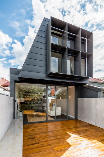
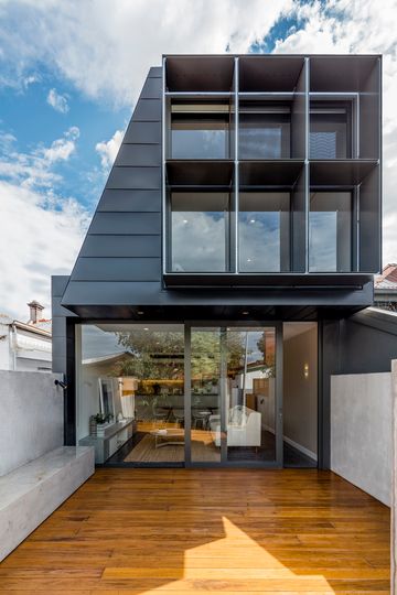
In Carlton, "properties are narrow in width and short in depth", explains Windust Architects x Interiors, with "rows of terrace houses, snug tightly alongside each other." In order to meet the needs of a modern family home, with open-plan living as well as four bedrooms and two bathrooms, there was only one way to go: up. And that in itself poses a challenge, with strict overlooking and overshadowing controls. Besides, it doesn't seem very fair to seek your own sunlight at the expense of your neighbour, does it?
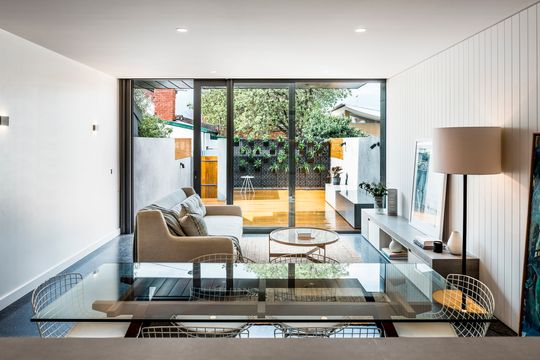
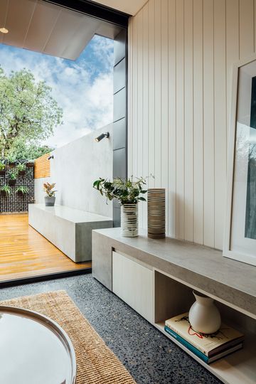
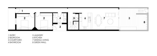
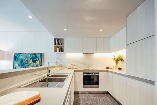
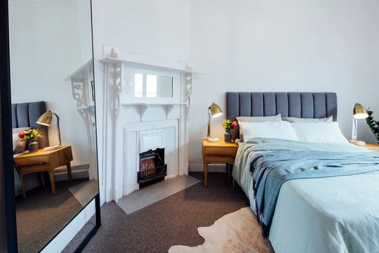
The first step for the architect was to create a light and airy ground floor. If you took a big red texta and divided the block into two, the original front part of the home would be bedrooms and bathroom, while the rear half would be one long, continuous space - including outdoor space. A green wall punctuates the back wall of the block, creating a lush green outlook from anywhere in the living area. That, really, is the beauty of this design. The architects have considered both indoor and outdoor space equally, which maximises the use of the site and makes the ground floor feel much larger than its internal dimensions.
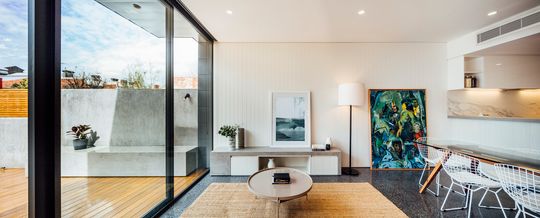

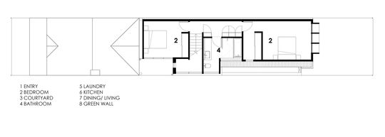
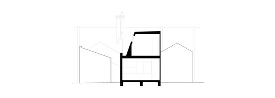
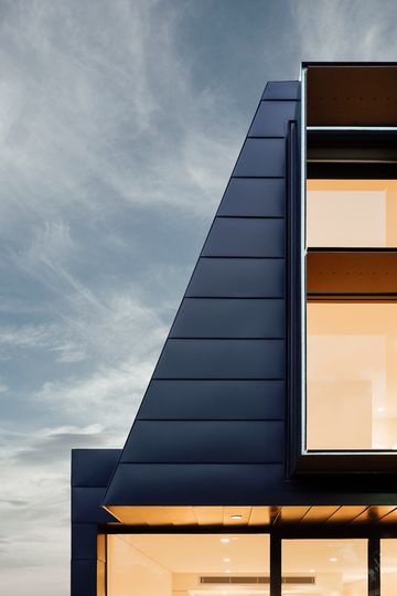
Upstairs is a different story (pardon the pun), where the practicalities of overlooking, overshadowing and boundary setbacks come into play. "The upper-level form is created from the want for appropriate space requirements, rubbing up against the need for sunlight into the north facing windows of the adjacent property to the south", says the architect. In section, the shape of the upper level hugs the north boundary and is set-back and slopes on the southern side to ensure light still reaches the neighbour to the south.
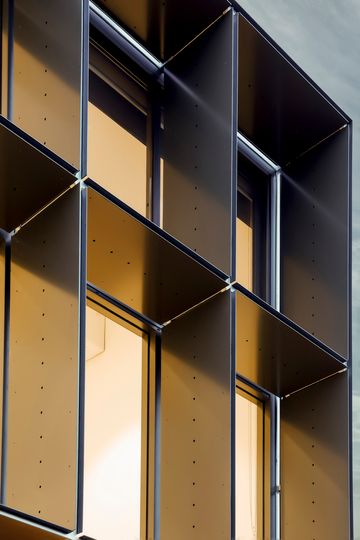
A waffle-like screen on the upper storey helps to keep the neighbours out of your business and vice-versa, while also providing shade to the large bedroom window. This design avoids the common-place (yet awful) solution of frosted glass below eye-level (1700mm) to prevent overlooking.
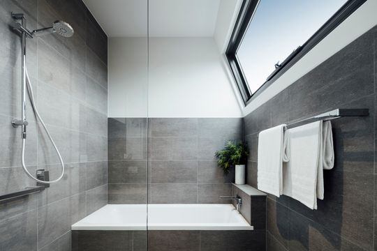
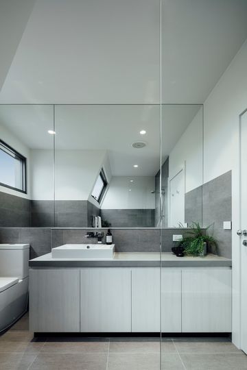
Similarly, in the bathroom, a high-level window ensures privacy, while also letting in natural light. No need for frosted glass here. Instead, an unobstructed view of the sky.
Dark, dank terrace seeks space and light. It may be an old story, but it's also a popular one. And despite the constraints of space and neighbours and heritage controls, there are still new and interesting ways of telling that classic tale. Besides, who doesn't love a happy ending?
