Sometimes the simplest solutions are the best. It was early in the project that architect Rob Kennon discussed with his clients how simply they could transform their home by demolishing the rundown South-facing lean-to and replacing it with a new, cost-effective 'box'.
And the simplicity of that idea stuck -- with a few tweaks that 'box' became a way to keep the budget in check, improve the livability of the home and create a stunning spatial experience as well…
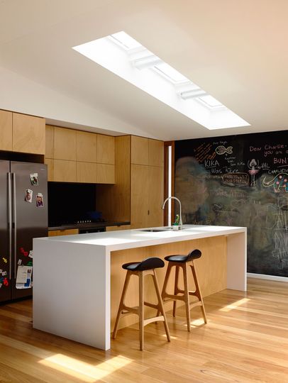
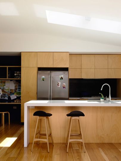
North-facing Skylight: Kitchen is lit by a North-facing skylight.
Accessing Light
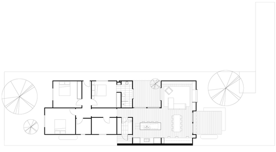
A big challenge for the project was access to light. The South-facing lean-to had been dark and dingy. Both owners and architect were keen not to repeat the mistakes of the past. In the new design, utility spaces that don't require North light (laundry and ensuite) were pushed close to the South side of the existing weatherboard cottage. The ceiling heights of these spaces were lowered. Meanwhile the ceiling level in the kitchen and living areas rakes up -- creating a generous sense of space and creating the opportunity for a North-facing skylight over the kitchen.
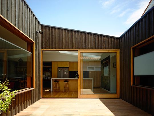
Light Courtyard: A small courtyard lets North light into the living areas and morning light into the kitchen.
Courtyard for Light and Ventilation
The kitchen, living and dining area are then arranged in an L-shape around an East-facing courtyard. This allows North light into the living areas and improves cross flow ventilation, while the kitchen receives beautiful morning light from the East and views of a distant gum.
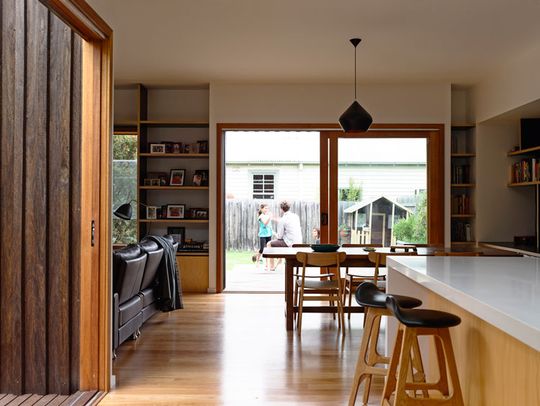
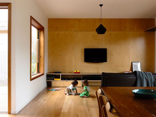
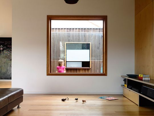
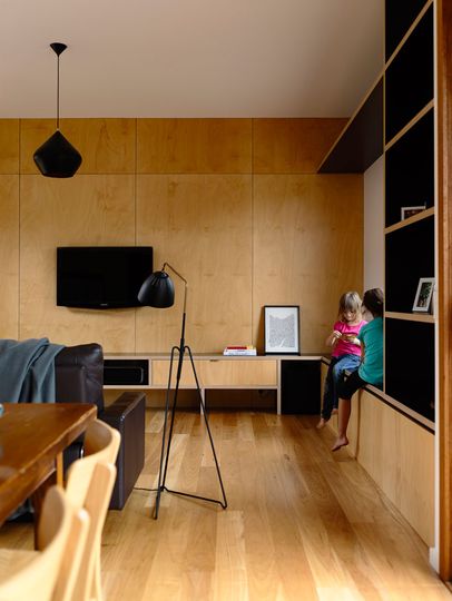
Built-in Joinery
Integrated joinery in the interior creates space for storage. Flip up panels under bench seats become the perfect hiding place for kids' toys at the end of the day. A deep South-facing reveal makes space for shelves of photo frames and cookbooks.
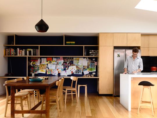
Containing the Mess
A kids' homework and craft desk is tucked beneath a lowered ceiling required on the west boundary -- attempting to confine the mess of a young family.
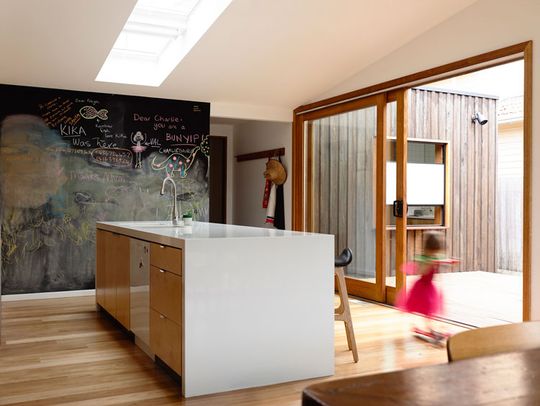
Blackboard Wall: A whole kitchen wall is coated in blackboard paint as a fun way to keep lists, draw pictures and generally have fun as a family.
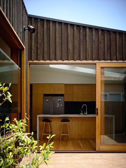
Batten and Board
The exterior uses a sustainable and cost effective batten and board cladding. If the style looks familiar, you're right! You've probably seen it used on fences before. But this time it's chunkier. The varying depth of the cladding means shadows play over the wall during the day.
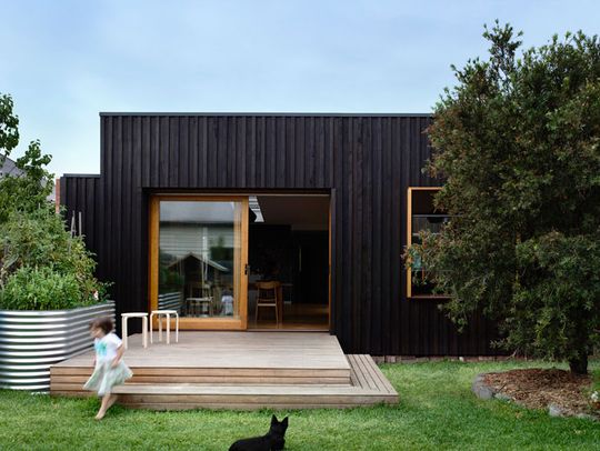
Water Wise
A lush green lawn -- a favorite place to play for the kids -- is watered by a slimline water tank tucked away at the side of the house. Another matching slimline tank is used as an easy-access kitchen garden right next to the back door.
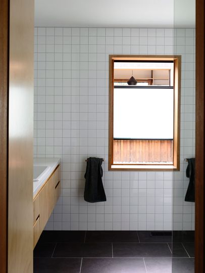

More than a Simple Box
"Although the original project was sculpted to create something more detailed than a simple ‘box’, the modesty and functionality of this initial scheme is still present. The new works provide the house with a pleasant flow and amenable volume, enhanced by the slender central courtyard. Each space has been given its own character through varying ceiling levels, amplified access to natural light and shifts in texture." -- Rob Kennon Architects
Rob Kennon Architects also designed this modern beach shack. If you like how dramatically this simple extension transformed this home, you'll love this extension which blurs the line between indoors and the garden.