Take a tiny, acutely triangular site, add a demanding heritage context and you've given your architect a challenge. But look what she did!
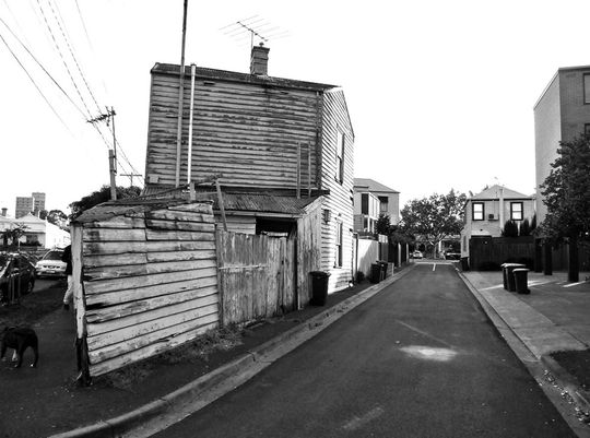
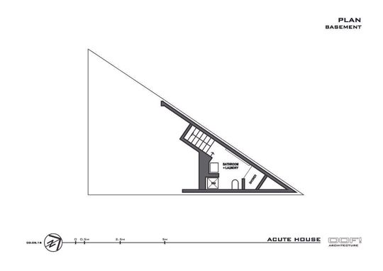
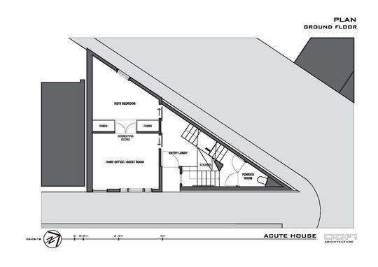
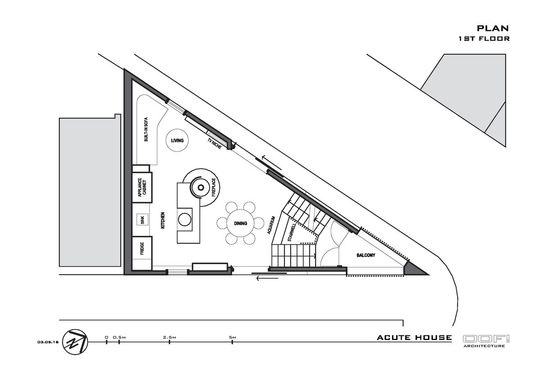
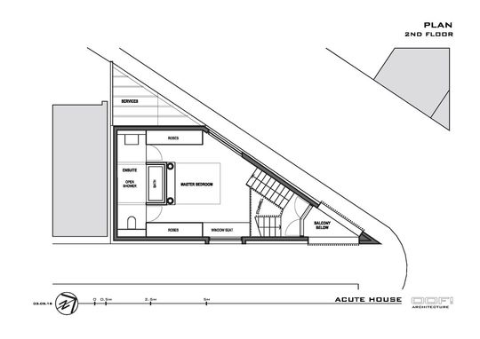
Before OOF! Architecture came along, even the most brazen of real estate agents wouldn't describe this derelict Victorian cottage as a renovator's dream - it was more like a nightmare. Not only is the block tiny (around 50 square metres), it's also a right angled triangle. And if you remember much from your school geometry lessons, you'll realise that means two very acute angles - making it somewhat difficult to furnish... Add to this mix a challenging heritage context and you have a recipe for disaster innovation.
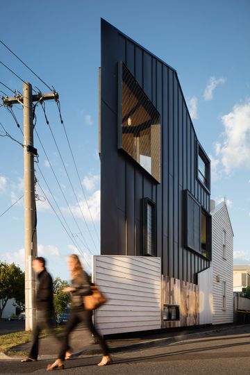
In spite of its poor condition, the home was loved by people from the tight-knit neighbourhood and its new owners due to its unusual triangular shape and its prominent corner location.
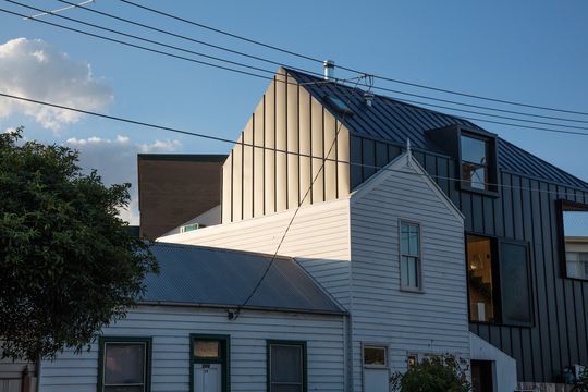
OOF! Architecture took these challenges in their stride, and architect Fooi Ling-Khoo designed a compact urban home which makes the most of its (admittedly many) problems.
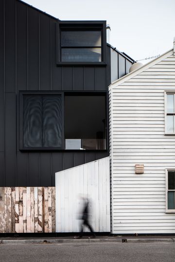
"We tried to retain its weathered character by re-using as much original fabric as possible from warped weatherboards and fence palings to random accumulations such as door knobs, vents and street numbers. Like fragile museum artefacts, these were carefully removed, labelled, stored and re-installed in their original location on a new mount that not only highlights their charms by contrast but allows the house to live again in a new way." - Fooi Ling-Khoo
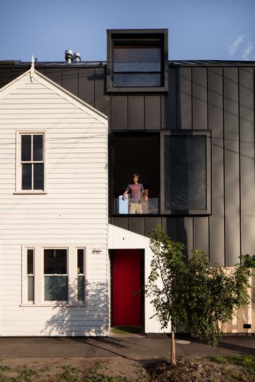
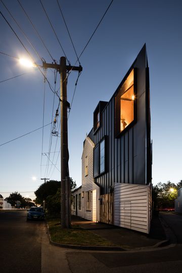
The original form of the house was retained and contrasted with a sleek new black form. The matt black aluminium highlights the rough, weathered texture of the salvaged weatherboards. Inside, birch plywood gives a warm, textural feel which, combined with the triangular geometry and a webnet mesh stair balustrade makes the home feel like a quirky urban yacht.
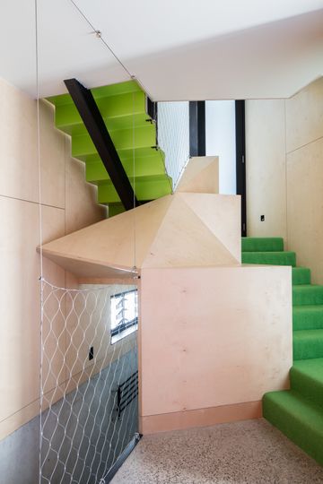
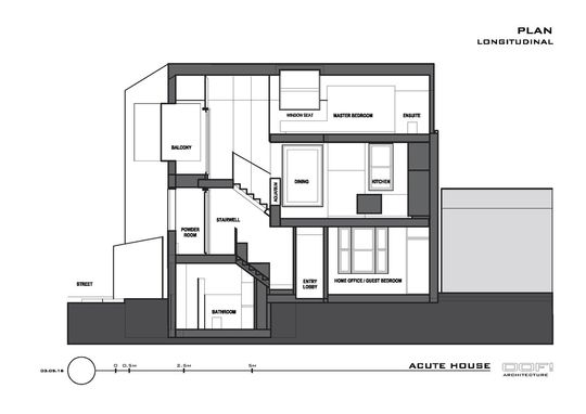
Given such a tight block, the architect had to rethink the layout and detour from that of a conventional family house. Living areas are spread over three split levels to house the basic spatial needs on the site. The split levels are connected by a stairwell to create a sense of connection between levels in-spite of the level change. The level changes also create a sense of privacy and definition without the need for internal walls, corridors and doors which would make the home feel smaller.
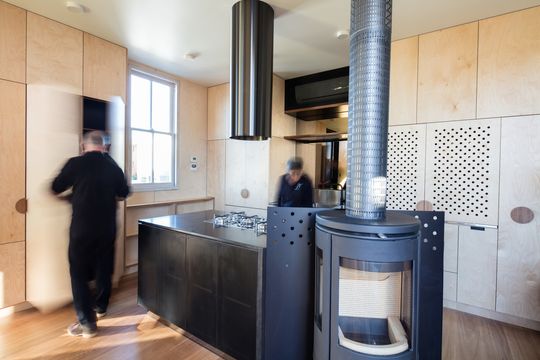
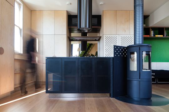
Due to the size and unusual geometry of the Accute House council approved a 100% site coverage. The problem with this is there was no space left for a traditional garden. To combat this problem and ensure the owners wouldn't experience cabin fever, the architect created an internal landscape of lawn green carpet, hanging plants, a central aquariums stocked with fish and aquatic plants and plenty of natural light to every room. Sliding doors open the living area onto a pointy, but generously sized balcony, turning the whole space into an outdoor room.
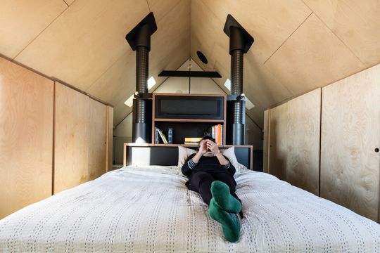
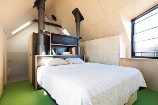
The response to the renovation has been very positive - neighbours love that the qualities of the original home have remained and have been reinvigorated by the modern alteration.
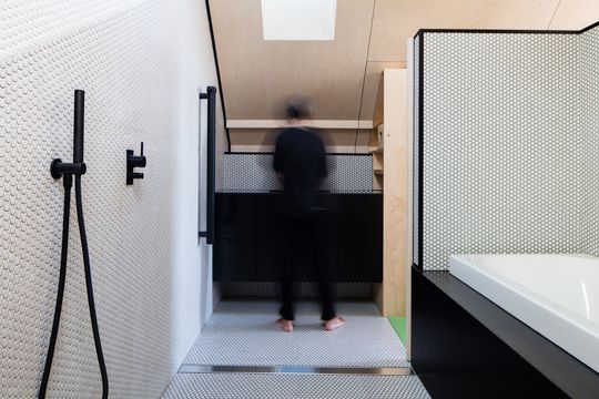
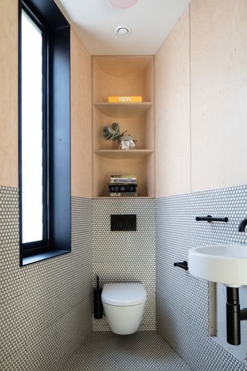
"It takes on the challenge of preserving an important but almost unsalvageable local landmark by working within the general typology of the surrounding neighbourhood, 'rhyming' with its housing stock while remaining resolutely contemporary in its expression and articulation." - Fooi Ling-Khoo
