For Lunch with an Architect this week, I joined Emma Young from PHOOEY Architects for a chat about up-cycling, surrealist montages and the realities of shipping container houses (amongst other things)...

Brodie: Emma, welcome to Lunch with an Architect! In keeping with the name of the series, where's your favourite lunch spot and what's your favourite dish on the menu?
Emma: I go to The Daily Kitchen before 11:30 because then I get a free coffee. I usually get the Salmon Protein Box which has smoked salmon, carrot, celery, capsicum, tomatoes, lots of spinach, a little tub of hummus. I add my Vita-Weats from up here in the office and I eat at my desk, because I’d rather spend more time with my kids when I get home!
Frugal and efficient - great qualities in both a lunch and an architect!
Can you tell us a little bit about PHOOEY and the way you work?
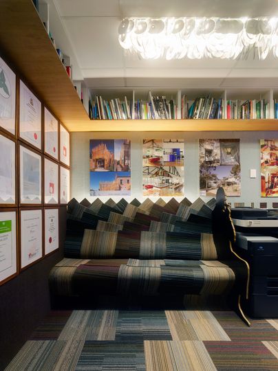
Carpet Couch: One of many carpet couches PHOOEY have designed from salvaged carpet, this comfy creature in PHOOEY HQ is made from up-cycled carpet tiles. And that's a lamp shade made from old Shannon Noll CDs (I'm guessing) overhead!
We're a family-run studio. We're a husband and wife team, although we're not working together that much at the moment, because Pete's doing his PhD. We've usually got two to three staff depending on how much we've got to work on. It's very much a studio environment, we try to keep the middle desk clear to lay things and out and talk. We're always overhearing what each other are saying…
That's the beauty of a smaller office, isn't it?
Yeah, and it's also a really good form of quality assurance for different people to work on the same project. You tend to find the fresh eyes are the first to see problems. We tend to throw projects back and forth across the office. I'm the consistent one, I'm always on the project. I basically run it through from start to finish. Pete might do a bit more at the beginning, and I'll take it through after planning. That leaves Pete freer to do other things, like his PhD. After he finishes that I think he'd like to do some form of academia in his spare time. He also likes to do competitions. And I allow him to do competitions even though it costs us a fortune!
That's right, competitions in Architecture are common, but they do take a lot of time and resources to enter, don't they
It's like entering the lottery! I've got this rule about one a year, because usually it's a good three weeks of work, it's pretty full on. You can lose a lot of money doing that stuff too often.
Yes, you can learn a lot and potentially win the competition which would lead to great things, but you always need to balance that against making a living!
You do! But at the same time, we don't like to charge too much for our fee-paying clients. We only charge as much as we need to live on. That's the beauty of the family business.
One of the defining aspects of a PHOOEY project is your use of salvaged or reclaimed materials in new and unusual ways - the definition of up-cycling, really. Tell us about some of the materials that have found new uses in your projects.
Well, probably the most spectacular one was an old staircase for a house in Fitzroy North, Cubo House. It was a gorgeous old original Victorian staircase. It was quite windy and lovely and it had gorgeous decorative balustrades, but it was in the wrong place, and it was non-compliant and therefore unsafe because they had young children. They were also building a basement level, so they wanted a stair that could run continuously down the three levels. It just couldn't be reused. So we salvaged it and turned it into a chandelier that hung over the new stair. It's really beautiful and it's an impressive centrepiece when you walk into the house.
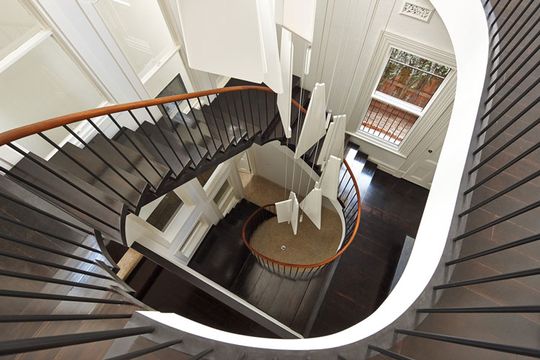
Stair Chandelier: Pieces of the original salvaged stair are artfully hung from the ceiling to create a striking statement in this renovated home.
And people might not realise it was originally a staircase, right?
Yeah, because we did finish it quite beautifully. We had it epoxied, so it was quite beautifully finished. But all you need to say is 'that's the old stair' and then it's very obvious. We also hung a lot of balusters from the ceiling as well.
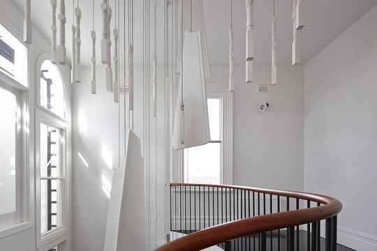
Stair Chandelier: Even pieces of the the original balustrade are incorporated into the stair chandelier.
Pete's actually doing his PhD in adaptation and reuse. And interestingly, while he's been absent from the office, we've had a lot of new housing work that's come in. Until we had an impressive house like Cubo under our belt, we hadn't had a lot of requests to do housing. Now that we have, we've got a lot more housing which is great because we love working on houses.
A lot of the houses we're working on at the moment contain salvaged items and recycled materials but don't feature much up-cycling. This is partly because due to the budget and partly due to other priorities, but also the houses themselves didn't have anything resilient enough to be up-cycled.
This one in North Fitzroy had a lot of really great stuff. The clients loved the house, they bought it for a reason, but they didn't want to lose the character that was offered by those beautiful bits and pieces. So we kept as much as we could and used them in interesting ways throughout the house. But the process of adaptation and reuse can be quite challenging when you've got a house that doesn't have any gorgeous defining bits and pieces.
You know, builders will often talk you out of [salvaging materials]. They frequently advise clients that it's actually cheaper to get new materials or at least you'll get new materials for the same price.
And it can be a pretty easy decision for the client then, can't it?
Yeah, it can come down to what they believe in, but it can also be a matter of how far we are stretching their budget.
We're doing a house in Glen Iris and the client's Dad was a builder, so she grew up on a building site scraping off bricks. She is so comfortable getting her whole family to go to site and sit around on a sunny day and scrape bricks, so they're reusing all their bricks, which is great!
There are certain projects that are specifically about up-cycling, and there are other projects that are not. It really comes down to listening and respecting what the clients want.
You've already told us a little about Cubo House and it's a project we've previously featured on Lunchbox. I think it's a fantastic project that brings together a lot of your ideas as a practice. Can you tell us a little bit more about what that project involved?
Cubo House is not on a large block, but it is in a Blue Chip part of Fitzroy North, right opposite a park. The clients really wanted to get as much space as they could from the house. So we had to maximise their site, without upsetting the neighbours - they really wanted to live there for a long time and forge good relationships. So instead of going three stories high, we decided to do a basement. So we scooped out a whole lot of the site, and the builder didn't sleep much for about four or five months…
Basements are not very common in Melbourne, are they?
No, and there's a reason - they cost a fortune! This was the most expensive part of the house. I mean, it's a really beautiful high-end house, but the basement? Oh my goodness, it really cost a lot. Just for all the underpinning, all of the reinforcement, waterproofing, pumps… The Melbourne water flood line was about 2 metres above the basement floor level, so we had to put a sump and a pump in there to protect the basement as well as getting a full waterproofing contract.
But it was a lovely project. It was built by the brother-in-law of the family. He did a wonderful job. Our job, amongst other things, was to make sure everyone was friends at the end. I think we pulled that off reasonably well.
We used a lot of salvaged bricks. There's a lot of brickwork, but we didn't want to use them in a way that was the same as the brick that was already there. So we applied a surrealist technique called Cubomania to the portions of the building that were to be demolished. So we basically put a grid over the two elevations of the facades and then we cut up all the bits and pieces and turned some of them onto their sides.
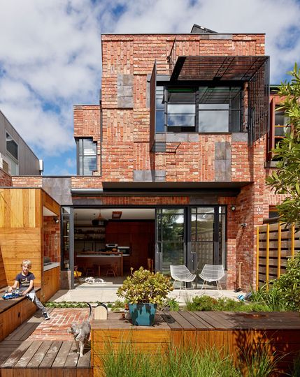
Cubomania: Cubo House uses the surrealist cubomania technique to arrange the new facade from reclaimed materials.
Oh, so you physically cut up the facade and arranged it until you were happy with the design?
Yeah, we created a physical collage. We placed the windows where we wanted them and then created a montage that became the facade of the building. That Cubomania technique followed through into the bathrooms, the kitchen joinery and all throughout the house. We used that technique as the overriding principle for the house. All throughout the garden we used the technique as well, which won the Edna Walling Landscape award. That was quite exciting. We had a great time working on that project.
Right, the Cubomania concept gives you a rationale for decisions in other parts of the house. It's a great way to tie a project together and give it a deeper meaning - a unique character, if you like.
Very early on in the craze for shipping container architecture, you designed the Children's Activity Centre. It's still one of my favourite shipping container projects because you made a really functional space, but without whitewashing the 'containerness' (I made that word up). In true PHOOEY style, you sliced and reused the container in new ways. Can you tell us about some of the ways you reused the container?
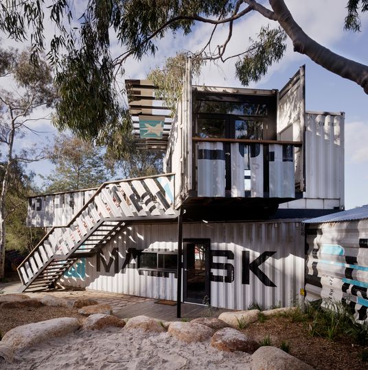
Children's Activity Centre: PHOOEY cut and carved shipping containers for this fun project, but the reality is shipping containers are not always cheap building materials.
Oh, we used all the leftovers. We created balustrades and sun shading awnings. But we also tried to minimise how much we actually cut the container. The interesting thing about containers is they are a structurally integral unit. When they're on a ship or stacked up high, they're self supporting, but as soon as you rip out some of the wall, you lose the integrity - you've got to replace it with something. And that's where the expense comes in.
It's 2.2 metres wide by the time you clad the walls. A lot of people think, 'I can't live in a small space that's 2.2 metres wide, I'm going to have to join two together and rip out the bits in between.' That's defeating the purpose, because you have to replace the structure and it can become quite expensive.
So from the start if you can minimise the cutting, it is possible to come up with a design that actually has some form of efficiency to it.
It was a great project, but you know, it didn't have any plumbing, it didn't need an energy rating so we were able to keep costs down by leaving out all those things. That project has resulted in an enormous number of phone calls from people who say, 'I love your work. I've got $20,000 and I want to build a three bedroom house out of shipping containers.' And it's just so hard to tell people they're dreaming...
Yeah, it's a misconception that shipping container architecture is a super cheap option and super easy to build! Sorry everyone who's dreaming about a shipping container house. But unless you can do a lot of the work yourself and you're willing to minimise modifying the containers, you probably can't build a very cheap shipping container house.
Exactly, labour is expensive for normal people who do not have building skills and have to hire people - even more expensive than materials nowadays.
And we really tried to minimise waste by reusing offcuts. Around 95% of all the waste was reused on site.
The waste is something a lot of people overlook. They might choose green products or integrate sustainability systems, but it's easy to forget about all the waste generated by the project - and it's huge!
Oh yeah, there's so much waste! And it's often easier for the builder to chuck things rather than storing it and finding a use for it. We fully documented all the waste products so that it could be retained. We had all these diagrams ready to go - it was a part of the contract.
What do you and PHOOEY bring to a new residential project?
How do I answer that without sounding like a complete egotist?!
I am a very organised person, so I will apply my organisational skills to make each project an absolute success, to run as smoothly as it can.
We as a team try out multiple options. We never just say, 'right that's it!' We test options. We keep throwing various options at the client. I think it's about empowering people - trying to help them decide what their priorities are.
We always ask people to give us precedent material. So they'll come, maybe they'll have one or two of our images, they'll have a lot of other architectural images they've picked up along the way.
It really comes down to understanding what it is that they like about that image. Is it the light? Is it the timber? Is it the tiles? Is it the sense of openness? And by the way, you can't afford steel framed windows…
Because at the end of the day, everyone wants more than they can afford. There's also a balance between being gentle with people and being honest. We're doing some work at the moment with some very good friends, they're just great to work with and we drink a lot of wine when we're presenting.
Sounds like a great project!
It's just really fun. With them, we'll basically just say, 'Nah, you can't afford that'. They need to know that.
Our process is all about managing expectations right from the start. We're not even finished schematic design and we've tested the town planning and budgetary requirements. We try to be very responsible about how we deliver the dream within the budget and within a realistic expectation of whether the authorities will actually allow us to pull it off.
The best design in the world is completely useless if it can't actually be built. I don't want to work on any more projects that don't get built. So we do everything we can right from the start to manage expectations and make sure it's possible.
What new and exciting residential projects are you working on at the moment?
We currently have six projects under construction.
They're all a bit special…
We have Fyffe Street House where we have created a new side-entry which minimises corridors inside. There are plenty of passive heating & cooling strategies, some fun circular elements and fancy tiling details to give the home character.
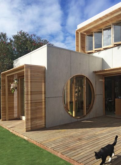
Fyffe Street House: A new side entry has helped this alterations and additions project reduce internal corridors.
We have a house in St Kilda East which is similar in form to Fyffe Street House, but completely different in its functional layout. We've used similar screening techniques, because nowadays councils all want privacy screens! And they double as sunscreens. It's the same builder [as Fyffe Street] and he's very good with timber.
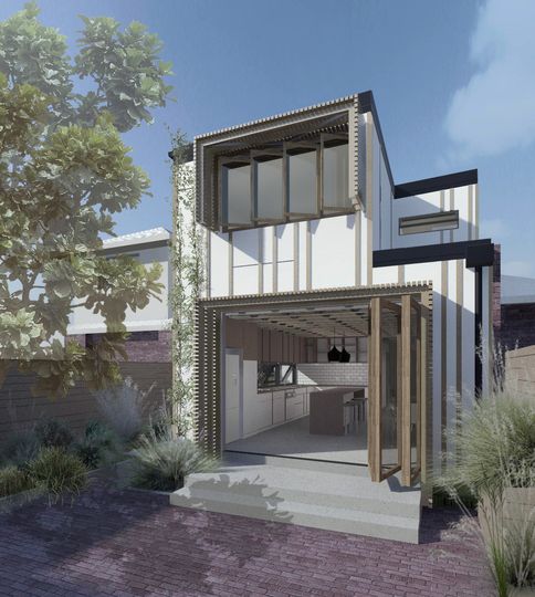
St Kilda East House: Timber details and privacy screens make this home sing. Inside, exposed Posi Strut ceiling rafters will create a stunning feature.
There's a house in Glen Iris. That project has a completely different site constraint. It's for a young family and their whole garden and massive frontage is completely west-facing, so they get blasted by afternoon sun - they can't even look out, it overheats the house. So we've done all these beautiful sliding screens that close off a big alfresco area. We've got North-facing windows and adjustable louvres on the western facade, so they can close up the whole place, or have it slightly open depending how they're feeling
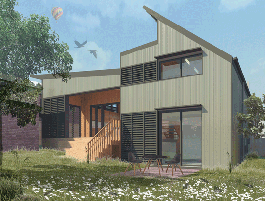
Glen Iris House: Sliding louvred screens will protect the family from fierce west sun and create a safe play space for the family's child.
Then there's Alphington House. That just got a building permit yesterday. It's going to be a gorgeous house. The clients were very inspired by mid-western architecture - Frank Lloyd Wright and Richard Neutra. When we were signing the client-architect agreement they said their brief was to be, 'as good as Frank Lloyd Wright. Or better.' I rang up and said, 'We're pretty good, but I'm not sure we're that good…'
Not willing to sign off on that one?
No! He had a chuckle and said, 'that's fine' and they’ve been terrific to work with.
It has a pool out the back and lots of striped windows. The clients call them cheese-sticks.
That's a flattering name for your windows…
They're glamorous cheese-sticks.
Of course…
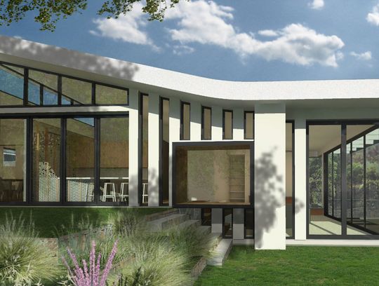
Alphington House: Emma was right, those cheese-stick windows are pretty glamourous. Frank Lloyd Wright, eat your heart out!
There's a couple of daybeds that are inserted into the facade that look really great and they provide a lovely spot for people to sit.
It's been an awesome project. But I really don't know how to describe it in an interesting way, this is my problem. I have to spend a little more time figuring out what is unique about these projects so we can talk more eloquently about them!
Don't worry, your projects speak for themselves! Thanks so much for your time, Emma. It's been really lovely chatting with you and good luck with your upcoming projects - we can't wait to see the end results here on Lunchbox.