"The courtyards built in modern buildings are very often dead. They are intended to be private open spaces for people to use - but they end up unused, full of gravel and abstract sculptures." - Christopher Alexander, A Pattern Language
Not that there's anything wrong with abstract art… But I'm sure we all know a courtyard or two like this!
So how do we design a courtyard that actually works? Because a courtyard that works well becomes a space that is a natural extension of the home, a place to live in. While a dead courtyard? Is little more than an expensive sandpit (or, more likely, a ritzy public bathroom for cats).
My mate* Christopher Alexander gives us some advice in A Pattern Language:
* I don't actually know Christopher Alexander, I just really like his book.
1. Create edges that are somewhere between indoors and outdoors.
You want it to feel comfortable to linger at the edges of the courtyard. Ensure that at least one edge of the courtyard is a covered outdoor space, like a verandah or porch, that you would naturally pass through or spend time in.
2. Doors on at least two opposite sides
Think of how much of an effort it is to get up and find the remote when you're curled up on the couch binge-watching Grey's Anatomy. Similarly, if it's difficult or inconvenient to access the courtyard, you won't. It's really as simple as that. Incorporate two doors opposite each other, so crossing through the courtyard becomes the easiest option.
3. Provide a view out
Courtyards enclosed on all four sides can feel dark and oppressive. Provide at least a glimpse of another, larger space. This will make the courtyard feel less like a glorified light-well and more like a private, sheltered space.
Let's take a look at an example of a courtyard that works well because it incorporates the ideas that Alexander talks about:
At Laneway House by 9point9 Architecture, a covered outdoor dining space takes up one side of the courtyard (Rule #1, tick). The courtyard here is quite large - like an enclosed backyard. But the principles are even more important for smaller, more traditional courtyards.
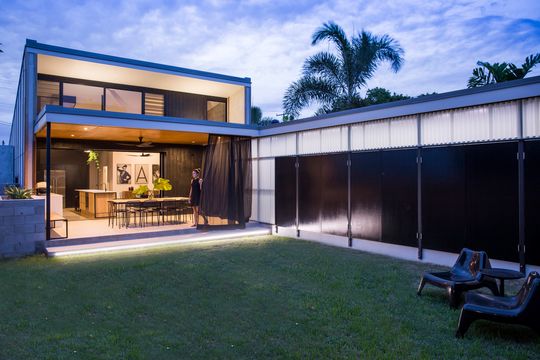
Full-height doors can slide back and disappear into the wall creating a seamless transition between the kitchen/living and the outdoor dining space. The sliding doors ensure you can effortlessly move from the living area into the covered outdoor area and blurs the line between indoors and outdoors.
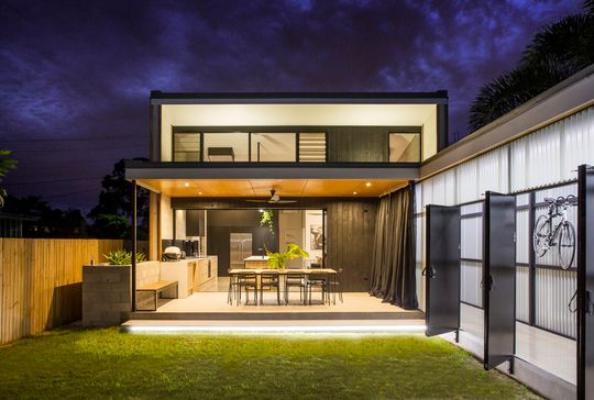
On the opposite side of the courtyard an external door leads to the bedroom and study (Rule #2), making it feel natural to cross through the courtyard to get to the bedroom (who's going to go the long way unless it's bucketing down, right?).
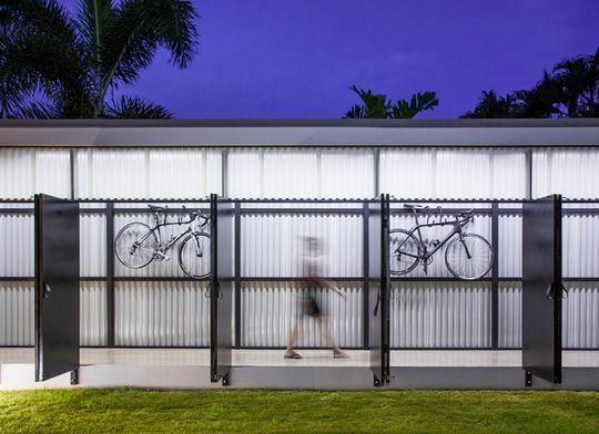
There are also doors into the covered breezeway making the courtyard a shortcut to the front door as well. Plus, the concrete slab of the breezeway is at a good sitting height, so the edge of the courtyard is even more usable, especially when throwing a big birthday shindig or otherwise entertaining a large group.
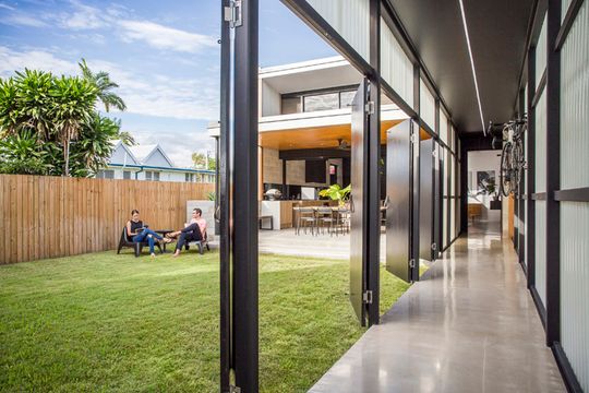
The fourth side of the courtyard is open, providing a view of the sky and distant treetops (Rule #3). The shape of the study and the location of the raised planter bed 'suggest' an edge which helps to define this space as a courtyard and means the courtyard feels more enclosed and private.
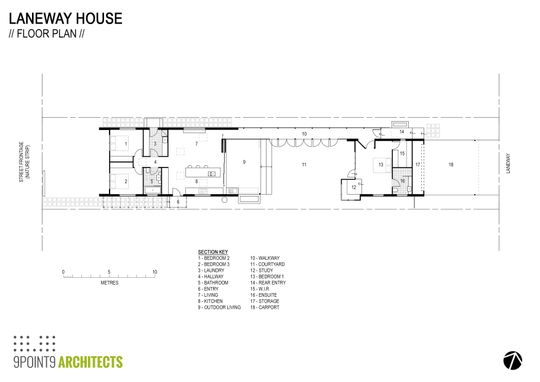
Laneway House proves courtyards are a brilliant way to bring light into the home, create a private outdoor space and provide better connection between indoors and outdoors. This living courtyard is a space we're naturally drawn to; a space that feels good to be in.
For more courtyard ideas and inspiration, take a look at our Courtyard Collection.